Wednesday, January 20, 2021

An Engraved Book: Fleur de Myrte, [1821]

Fleur de Myrte
(Paris: Janet, 1821)


In a previous post, I showed a document printed to look like a manuscript; this post will look at a little book I came across recently the bulk of which was printed entirely from engraved plates, without type.

And when I say "a little book," I truly mean a little book, as it measures about 3 7/8" tall. 

It is an example of a particular kind of book that I can't seem to stop myself from buying now and then: the almanac. In particular, it's one of a fairly extensive group of French almanacs from roughly the 1810s to the 1830s. They take the generic name of almanacs because they almost always have a little calendar included, but really they are little gift books, often aimed at an audience of girls or women, and they usually have French poetry as the bulk of the content. Like this one, they generally seem to have been issued in matching slipcases. They must have been aimed at the aspiring classes: filled with poetry, and available at a variety of price points: the present example is cheaply bound, but fine binding options seem to have been available, including leather, hand-painted silk bindings, and even the occasional binding in glass.

Bound in green card covers
with matching slipcase or etui.

In short, French almanacs of the period are tiny, cute, sweet, and can be found in a variety of bindings and treatments, and they are often at least somewhat rare. What's not to love about them?

Rare, of course, is a relative term. But these books, naturally enough, often seem to have been treated as ephemeral by their original owners, and many titles are fairly rare on the market these days. This particular little book, titled "Fleur de Myrte" doesn't seem to be available online at all (neither on ABEbooks nor on Addall), and only two copies are reported in institutional collections on OCLC/WorldCat: one at the Bibliotheque Nationale in Paris, and one at Yale.

First half of 1822 calendar tipped in before title.

WorldCat does not give a definite date; Yale estimates the date as "181-?" My copy must have been offered for sale in 1821 or 1822: there is a calendar present (six months at the front cover, and six months at the rear) and the calendar is for 1822. Presumably, the book might have been printed up some years earlier, and calendars added as needed; notably the Yale copy does not seem to record the presence of a calendar at all.

And the book, as noted above, is interesting in one other way, too: not only the title page, but all of the text pages of Fleur de Myrte are entirely engraved, and some are faced by engraved illustrations. Note that here, on the right hand page, the punctuation at the end of the second poetic line goes beyond the bounding line: impossible, really, if typeset, but no problem for an engraver!

Engraved illustration page and engraved text page.

I am always astonished when I buy a book which turns out to be held in so few major libraries across the world. (And I'm even more surprised when it happens that I get a printed book recorded in no libraries in WorldCat.) And that's one of the fun things about being a bookseller: here, with this little book, I can help pin down the date of publication for a book--it's not a major addition to our knowledge of French literature, but when Yale and the Bibliotheque Nationale don't know the date, it's a useful crumb of knowledge to contribute, even so. 


Sunday, November 29, 2020

A failure to follow directions

Missal leaf, with mistakes.
In a post from last year, I wrote about some guide letters, where a scribe (or, in that case, a typesetter) indicates to a rubricator what letter should be inserted in a space. Perhaps it should go without saying, but even when the directions are clear, mistakes sometimes are made.

In the case of the small missal or breviary leaf to the left (the whole leaf measures only about 5 3/4" by 3 1/4"), at least two errors can easily be seen. 

The more obvious one involves the red (i.e., rubricated) text written into the lower margin. It is, as one might be able to see, preceded by a little red caret; the matching sign can be found in line 18 of the first column, just to the left of the two-line red "n" in the right hand column. As I hope is obvious, the position of the matching sign indicates where the added passage belongs.

Very possibly, this was a mistake by the primary scribe; at the least it seems to have been corrected by a second scribe, who uses a single-compartment a, rather than the main scribe's regular, two-compartment a. It is notable that this correction has been written on a couple of added ruling lines, provided just for this passage.

The second error, however, is clearly made by the rubricator. 

Although they may be difficult to see on the full-page image of this page, guide letters survive in the right-hand margin of this page: q, n, and n. The first two were no trouble for the rubricator, but something went wrong with the third:

Closer view of rubrication error and correction.

For whatever reason, the left-hand side of this letter was extended across three lines, not two: it looks like the rubricator intended to make a p, but certainly what was originally there could not have been easily read as an n. Not only was the letter painted in with blue, but the decorative red-pen lines were added before the mistake was corrected: someone else, presumably, came upon this and scraped away the lower part of the letter and added black ink serifs at the feet of the n, to make the letter clear. 

I find it strangely comforting to know that my own failures, at times, to follow directions are nothing new in the world, and even medieval scribes and rubricators had their off days.


Tuesday, October 27, 2020

A Codex-Scroll? 1910 Ohio Highway Atlas

1910 Highway Maps of Ohio.
Books have been around for a very long time.  Codexes—by which I mean books made up of more than one leaf, bound together along one edge—have been around nearly as long, with single-fold examples surviving from Vindolanda, from the first or second century. Other multi-leave examples were preserved in Herculaneum by the eruption of Vesuvius in 79. 

During the long span of this history, there seems to have been endless experimentation with the basics of the codex form, and although I’ve been interested in physical books and book history for some time, every now and then I am still delighted to come across a book in a format that I’ve never seen before.


That’s the case with the book I am showing off here today. The book is an album of county maps for the state of Ohio, showing the state of the state’s roads and highways in 1910. Roads on each map are color coded: red for brick paving, orange for macadam, and blue for gravel. Probably it goes without saying, but a large number of Ohio’s roads in 1910 were none-of-the-above: unpaved dirt roads, presumably. 


[The road my dad lives on today, for what it’s worth, shows up on the relevant map in this atlas as just such a dirt road, which it still is now, 110 years later. He tells me, however, that soon it will be paved: and that’s infrastructure progress in Ohio.]


Anyway, this highway atlas is a codex, bound at the left edge; the first picture above shows the front cover, with printed text on very heavy brown cloth.


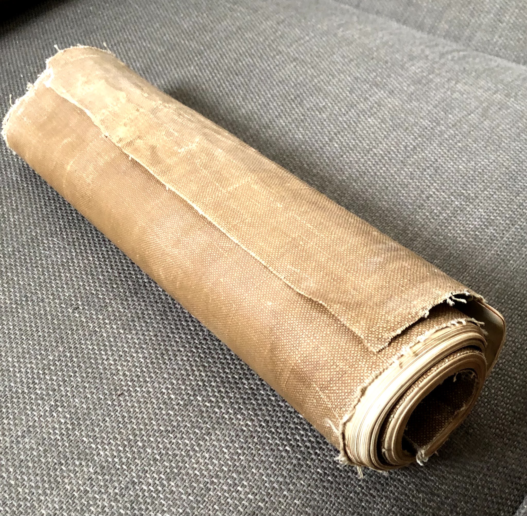
This picture, on the other hand, shows the book as it appeared when I purchased it:


1910 Highway Maps, as found.

As a rule, atlases and books of maps are like other books: condition matters, and one hopes to find each map flat and clean. The water damage visible on the front cover is not a pleasing feature, but the tight rolling-up of the book as a whole seems, at first glance, like a sad consequence of the books mistreatment and mis-storage across the last century or so.

1910 Highway Maps, showing
long extension of rear wrap.

But in fact, that's not the case. It seems (to me, at least) fairly clear that this copy of the book was issued to be rolled like this: the rear cover, made of the same cloth as the front, extends at least six inches beyond the edge of the text block, and this extension seems clearly intended to provide extra protection for the book when rolled. This sort of horizontal rolling make this printed codex at least a little bit like a scroll.


I have been unable to determine if all the published copies of this book were given the same treatment; it looks to me as if the extra cloth could easily be trimmed off, if one expects to store one's copy of the book flat. It would be a shame, I think, to flatten this one out, no matter how much that would ease the problem of storage.


It's a continuing surprise to me, when I find something I've not seen before--but it does still happen, once in a while. And so, surprise or not, I've come to expect that it will happen again.


Tuesday, October 20, 2020

King Alfred of Wessex Bookplate

Charles Fifield's Bookplate (ca. 1902).
The Corona-virus pandemic has recently virtualized two academic conferences I had hoped to attend next summer, the Medieval Congress in Kalamazoo (May 2021) and the International Medieval Congress in Leeds (July 2021). Of course it is true that the academic work of presenting papers (and attending papers as they are read) can still go on virtually, but I doubt I am alone in thinking that it's seeing old friends in person that's the true reward of going to a conference.

Had I gone, both of the papers I would have given would have at least touched on my old claim that King Alfred of Wessex (871-99) was a collector of books. So I was delighted, this week to come across this early twentieth-century bookplate that suggests much the same thing.

Located on the inside front board of a book from 1902, Charles L. Fifield's bookplate has a certain rustic charm, even if artistic appeal may not be its chief attraction. It may be the case that Fifield himself provided the drawing that the plate was made from. The little poem at the bottom of the plate says:

King Alfred, deep engrossed in book

  Forgot the cakes and let them burn

Remember Thou, the book thou took

  Ought to its owner soon return.

Of course, this refers to the legend of "Alfred and the Cakes," the most popular story ever told about Alfred: at his fortune's lowest ebb, he took refuge in a herdsman's cottage and was rebuked by the cottager's wife for allowing her cakes to burn when he ought to have been watching them. Almost certainly the story is apocryphal; it appears to suggest that Alfred as a "lord" of his people (Old English hlaf-weard = loaf-guard) had failed, and needed to be reminded of his duties: in the earliest records of the tales, it is not cakes that burn, but loaves (Latin: panis, breads). 

In most retellings of the story, Alfred is distracted by military worries about how to regain control of his kingdom, nearly overrun by the Danes; this bookplate's little poem is the first time that I can recall the suggestion that he was distracted by his reading.

Though some of my readers may recognize it, it may be worth explaining that the Old English phrase on the bookplate, "Alfred Mec heht gewyrcan" is the text on the Alfred Jewel, one of the great treasures surviving from late ninth-century England, often associated with Alfred's literary and book-producing activities.  

It's a delight to add this little homage to Alfred to my own collection of books, where it can also serve as a reminder, perhaps, for me to take an extra bit of care with my pandemic baking. 


Monday, October 12, 2020

Mini-Catalogue Monday 204: Leaves, Fragments, and Archives


One of the things I never quite imagined when I left academia for the word of selling rare (and not-so-rare) books was that I would come across material that can only be described as archives. In my case these have always still been small things (at least so far), nothing that can't fit in a single box, for example, even if sometimes it has been a fairly large box.

Of course, when I work with medieval fragments, I always commit to keeping fragments together whenever I can, and the same is true with this kind of archive: splitting things up that belong together just doesn't seem quite right.

Anyway, there's a handful of such lots or small archives in my newest little catalogue, number 204.  The one I want to talk about in this blog is one I was particular glad to find.

The archive itself is quite small, only five items. Two are books, and three are pieces of artwork. All are signed by the well known New Yorker cartoonist Ed Fisher, who is an especially interesting figure for me because of my interests in both medievalism and comics. The books are Ed Fisher's Domesday Book (1961) and Ed Fisher's First Folio (1959). Even the titles exhibit a kind of medievalism, and many of the cartoons inside them do as well.

But these are New Yorker cartoons, or at least ones in the New Yorker mode, so they always comment on contemporary matters as well. But I love the medievalism of this cartoon depicting a stained glass window--with air conditioner:


And the alien invader confronting the armored car in the following cartoon certainly makes some visual references to the medieval suit of armor:


But as much as I like those two cartoons, it is the depiction of the constellations over Times Square that I find most wonderful here. In this one, Fisher's reference in the past is perhaps the classical world, rather than the Middle Ages, but what an iconic cartoon for 1950s New York!

And that's the thing about archives, too: they are always a reminder that collections are more than the sum of their parts: the juxtaposition of past and present in these three cartoons is augmented, somehow, by their juxtaposition with one another. And that's why it seems important to keep them together.

Wednesday, October 7, 2020

Printed to look like script, 1708.

1708 Obligation bond,
in Latin and English

Naturally, when the printing press first appeared, the newly cut types were intended to look like letters. Since, until that time, manuscript letters were practically the only letters anyone knew, of course early printed books ended up looking visibly similar to manuscripts. 

On the obligation bond shown here, dating from 1708, the printed text is also intended to look like manuscript letters, but for a manifestly different reason. Here, the printed portion of the document is supposed to look like a manuscript, and--implicitly, at least--a typeset version (with more type-like letters) would not be as acceptable. 

Part-printed documents had made use of conventional typesetting for some time before this, at least in some contexts, but for one reason or another, the visual look and feel of this kind of document seems to have still benefitted from this script-like presentation. 

There are other observations we might make: it looks to me like there is a plate mark around the edge of the paper here, so it seems best to suggest that the printed portions of this bond were made from an engraving, rather than from a woodcut.


I'm not sure if it can be seen readily here, but each of the two men named Richard Thaier who seals this document (father and son), seems to use the very same seal, which features an anchor. 

It's just a simple document, but interesting, even so.

Saturday, October 3, 2020

A French document recycled as a pouch, pocket, or wallet

It's been a long time since I've posted anything here on the Chancery Hill Books blog: it's been a strange few months of Covid isolation, and while I've been (fortunately) able to find a few things to buy, I haven't had much motivation for writing.  But there's almost always something to share, even if it's small.

1629 French document on vellum.

The item I wanted to show today is a little French document, roughly eight inches by ten when folded. It is somewhat difficult to read because of aging, the translucence of the vellum, and the rapid French cursive documentary script of the time, but a later hand has at least given us the date: 13 mars 1629. Probably, this is an eighteenth-century hand; at the least, it probably indicates something about the date this document was recycled.

In form, this was originally a little single-fold booklet, four pages, with writing on all four. As it stands now, this is its current from, too: though an additional horizontal fold occurred at some point, almost at the half-way line, visible in the image only as a darker line at about the tenth line of writing. 

Documents like this must have been extraordinarily common in seventeenth-century France: they can only be described as common today, although this one is obviously very close to 400 years old. In the eighteenth and nineteenth centuries (perhaps with a peak after the Revolution) such vellum documents were frequently recycled in bookbindings, as wrappers or spine strips or covers for card boards.

The only evidence for the recycled use of this document however, is a series of small holes at the top and bottom margins of the document:

Note the pierced holes at bottom margins.

These holes go right across the top and bottom margins and across both leaves of this little bifold: at first glance, they might be mistaken for the pricking holes so often used to rule lines on vellum in medieval manuscripts. But, of course, the lines that could be ruled from these holes would be vertical here, rather than horizontal.

And these holes are not spaced particularly evenly, and they were certainly made after the sheet was folded: the simplest explanation is that these were sewing holes, and that this sheet was once sewn up to be used as a pouch or wallet, presumably to hold important papers or documents. 

Perhaps this says more about me than about such documents, but I find the evidence of recycling more fascinating here than the original document itself.