Tuesday, April 16, 2019

Mini-Catalogue 192: Poetry, Manuscripts, Archives.

I've spent a good part of the last several weeks getting some new bridge-work done on my "two front teeth," as the old song has it. I lost one of them in a basketball encounter with the back of a friend's head in the early nineties, and just like all across the country, I guess the infrastructure in my mouth was finally beginning to crumble. Luckily, I was in a position where I could get it replaced.

English calligraphic broadside poem, ca. 1782

But I've also been able to put together a little list of 15 items, loosely grouped under the triple rubric of "Poetry, Manuscripts, Archives."  As usual, when I cobble together such groupings, some items fit more than one of the categories.

Included, of course, is the calligraphic poem pictured above, an English item I cannot help but compare to the colorful manuscripts that were being produced at the same time by Americans working in the "fraktur" tradition, inherited and transformed from German-language regions of Europe. 

Anyway, here's hoping you'll find something in the list to sink your own teeth into.

Monday, March 25, 2019

Mini-Catalogue Monday: 21 Unusual Nineteenth-Century Items

From David Williams's
Cymro yn Mexico, 1826.
It's been a while, I guess, since I posted a link to a small catalogue: but I've finally gathered enough interesting items together to make it possible again.

Nevertheless, this has been a fun list to put together, and while all the items are American (or at least have a crucial link to the Americas or American literature), I am glad to say there are items in French, Welsh, and German here. There are works of literature and works of science, manuscripts and printed books and comics, and some items that push the boundaries.

Perhaps my favorite of these items is the book of typed poems based on a weekly comic published in The Boston Globe in the early part of the twentieth century: I've always been fascinated with the genre of fan writing, where consumers or readers of text become, in turn, producers and writers.

Typescript of poems based on the Fatty Spillaker comics.
The poems in this book are, as it turns out, not very good--but I am not sure that matters so much. The whole production is a remarkable and early example of the fan-fic dynamic, I think.

Anyhow, the whole list is only 21 items, but across a range of interesting and unusual things. Enjoy!

Wednesday, March 6, 2019

Ladies' Gothic? ca. 1830

I’ve written here before about my tongue-in-cheek conviction that having three similar objects constitutes a collection. So again today, my little blog post will concern a small set of three books that make a kind of collection in themselves.
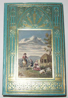
Hommage aux Dames [1827]

This collection is defined by their bindings, and in particular by a set of related stamps that have been used to decorate the boards of these bindings: all three have designs intended to represent the sorts of Gothic windows you might find in a cathedral.

The first of the three books I’ve shown is titled Hommage aux Dames, and it’s one of a handful of French nineteenth-century almanacs I’ve had, many of which have a minimal calendar included (this one has a calendar dated 1828) but are filled with little literary pieces and occasionally plates or songs. They were, it seems, available at a number of price-points, from simple paper-covered boards to more and more elaborate choices. This one, with gilt-stamped green paper-covered boards (with laid on colored engraved prints) came with a matching slipcase, and it was probably near the high end of the available binding options. The book as a whole could only be nicer if the internal plates had been hand-colored, but alas, they were not. But the effect of the colored engravings, placed as if they were stained glass images centered in the Gothic architectural surround, is still quite striking.
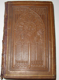
 
La Dame Blanche, ca. 1828
My copy of Jean-Pierre Brès’s La Dame Blanche, Chronique des Chevaliers à l’Écusson Vert, on the other hand, does have hand-colored plates (for an example, see below) as well as a hand-colored frontispiece. The brown leather binding is stamped with an especially fine split Gothic arch and rose window. It is probably to be noted that the interior illustrations are framed with Gothic architectural elements as well.
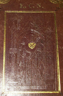
Album, ca. 1836
The third book of this little group is an American Album, originally filled with mostly blank pages (but including a few with illustrations). Such books were intended to allow one’s friends and family to add mementos: favorite passages of prose or verse, or drawings or even paintings. This particular example was owned by Elizabeth Cranch Norton, Preceptress of the Hingham, Massachusetts, Academy. One guesses it may have been a gift from her pupils, and their inscriptions are generally dated 1836. The embossing on this binding is comparatively poor, but I hope the picture will show the window well enough. 

It may not be going too far, I think, to describe all three of these books as “Ladies’ Books,” as a specific subcategory of gift books. The Dame Blanche, notably, has a gift inscription (in English) from three young women to another woman, the gift having been given in Lausanne. 


I find it interesting to observe the link between women readers/purchasers and this particular expression of the nineteenth-century fascination with this visual Gothic aesthetic, at this point very early in the history of publishers’ decorative bindings. This is a sort of book I will keep my eyes open for, I think.


Bibliography

Hommage aux Dames. Paris: Louis Janet, n.d. [but presumably 1827]. 

Jean-Pierre Brès. La Dame Blanche, Chronique des Chevaliers à l’Écusson Vert. Paris: Chez Lefuel, n.d. [but with a gift inscription dated 1827 or 1829].

Album. New York: J. C. Riker, n.d. [but before 1836].

[And though I’ve not yet seen the following resource, it’s probably useful to at least mention it here:

Ed Wolf. From Gothic Windows to Peacocks: American Emposed Leather Bindings, 1825-1855. Philadephia: Library Company of Philadelphia, 1990. ]

Wednesday, February 13, 2019

Wednesday mailbag

Well, we don't usually get enough mail here in Chancery Hill to need an actual mailbag, but often enough we do feel sorry for the mail carrier who ends up lugging around some of the things that get delivered here. Last week, for example, he brought me a copy of Henry Petrie's 1848 Monumenta Historica Britannica, weighing in at about fifteen pounds and standing about 16" tall. It's not the largest and heaviest book I've had, but nearly so.

1st communion souvenir, 1898.
Today, however, the load was lighter, with just two items. The smaller, about the size of a 3x5 index card, is a little manuscript item on vellum. It is a souvenir from a young person's first communion in 1898, and as I think the picture shows, it is written and illuminated in such a way as to be reminiscent of a medieval illuminated manuscript. The inks here are somewhat faded and worn, and I think there may be some discolored silver used, as well as gold.

The second item that was delivered today is forty years younger, but still more than eighty years old: not a true antique yet, but getting there. This is an 8x10 glossy promotional photo, showing The Ritz Brothers, in their 1938 feature film, Kentucky Moonshine. 
1938 Promo photo, to be reproduced in newspapers:
Kentucky Moonshine.

The Ritz Brothers never made it quite as big as the Marx brothers, but according to the brief Wikipedia plot summary for this film, they dress up as hillbillies in order to get discovered by a theatrical producer, presumably giving them a chance during the film to show off their singing, dancing, and comedy chops. 

Usually, the oddball stuff that comes in the mail is for me, but this promotional photo will probably end up being reproduced in Rosemary's forthcoming book on the figure of the "Mountaineer." 

And then, presumably, it will end up in one of our collections. 


Thursday, February 7, 2019

More on vellum and fragments in bindings.

I have long been fascinated by the recycling of manuscripts and the use of vellum (especially recycled bits) in book-bindings. In the case of vellum pieces re-used after having been written on previously, such recycling attests to a moment in time where the value of the written text has become meaningless, and the physical strength of the vellum has become the primary value of the scrap, adding its strength to the newly bound book.
An Italian painted vellum
binding for the tourist trade, ca. 1910.
Note the title here seems to read
"The Lakes of Morthern Italy."
Of course, such a perspective oversimplifies matters. There is every chance that--at least at some times and places--the aesthetic qualities of the recycled manuscript have been valued. Many old charters (originally one sided documents) were recycled as vellum wrappers with the unwritten side facing outwards: in such cases we are probably right to think that the clear side was valued aesthetically over the written side.

But when, around the end of the nineteenth century, painted Italian vellum bindings like the one shown to the left became popular, it was probably the case that they were themselves an extension or echo of the older practice of using recycled leaves. But the new style was beautified and regularized, replacing the random serendipity of a true medieval fragment with a carefully painted decoration in the medieval mode.
Vellum book cover, with painted embellishments, ca. 1900.
I have a couple books with this sort of binding, and I also recently came across a removable book cover probably produced about the same time. This one has a little poem (in Italian) on the front, and it could have been slipped onto the boards of any book of the proper size that the owner wanted to use it on. Presumably, the original owner was named Marion: tourists in Italy, one guesses, might have picked such things up as we might purchase key-chains or shot glasses with our names on them in tourist-trap shops today.

If these new-style painted vellum covers intentionally echoed an older binding style, however, we might ask how late into the nineteenth century manuscripts were recycled in bindings. A couple years ago, I gave a conference paper suggesting that, in the early nineteenth century, many schoolbooks and textbooks were bound in older (seventeenth- and eighteenth-century) vellum documents, and I have a handful of French-language New Testaments from the 1830s bound in similar documents. I wondered in the paper if the use on schoolbooks meant that such vellum bindings were among the cheapest binding options available, and that clear unwritten vellum or leather would have been more expensive.
Dickens, Le Mystère D'Edwin Drood,
(Paris: Hachette, 1887).

One of the latest examples of a vellum manuscript biding I've come across, however, is the one shown to the right, on a copy of the French translation of  Dickens's Edwin Drood, printed in 1887. There's no reason to suspect that this is a publisher's binding, I think: possibly this edition was issued in paper wraps and this was simply an independent binder's cheap version of a hardcover replacement binding.

This vellum piece is, as one might guess, a vellum document recording a financial transaction of some sort, and it appears to be clearly dated in 1779. I can't help wondering if a hundred years was generally understood as the lifespan of such a document, and that once a pile of such sheets had reached that age, they were shipped off to binders. 

Regardless, it is striking to me to see that only 20 or 25 years (or less) separate the Drood example and the Lakes of Northern Italy example. The one is a contemporary expression of a bookbinding practice that was utterly traditional, and the other is a conscious appropriation of the feel and look of a luxurious medieval manuscript designed to appeal to tourists. It is difficult not to suspect, too, that recycled vellum pieces--especially medieval examples--were no longer as readily available around 1900 as they had been in previous centuries: these Italian examples made good on the scarcity of handsome manuscript examples by constructing themselves as appealing substitutes or simulacra.

Here's some more pictures of these three items:


Friday, December 28, 2018

A Novel Rebus

Green and black transfer-printed plate, ca 1860.
Here at Chancery Hill Books and Antiques, I've been doing my best for the last year or so to shift away from the general line antiques and become more exclusively a rare book dealer. This has been somewhat difficult because I got my start in the business by buying and selling glass and china, and when I see something in those categories that's underpriced, there's always a great temptation for me to buy it.

And once in a while, I run across something that straddles the boundary between general antiques and rare books. The pottery plate shown here is an interesting example. It probably dates from around 1860, and when I first saw it, I assumed it was a typical Staffordshire transfer-ware plate. But the marking on the back identifies it instead as French ("Porcelaine Opaque de Gien"). 

The image on the front, as I realized just as quickly, is a rebus, and (fortunately) the solution is given on the reverse, just above the maker's mark.


The Uncle Tom Rebus
My French, I am embarrassed to admit, is not entirely good enough to piece together the whole rebus on my own. The last line, surely, is de [just visible on the side of the boat] +  lune (moon) + -i- + verre (glass), to give "de l'univers." 

In the line above, the child who identifies the adult labeled "Tom" as "mon oncle" must give us "de l'oncle Tom"; The picture of William Tell (with crossbow and an arrow-pierced fruit) with a capital U must give us "a éTell u", to be read as "a été lu".

The top line of the rebus, then, must give us "Le roman." But while I can see how the townscape is labelled "Ville de Mans," I am not sure which part of that townscape gives the element "ro-" or "-ero-."


Solution to the rebus and maker's mark.
Seemingly, the solution's word "tout" is not actually present on the rebus, unless I am missing something about the boat or the moon. Even so, the broad sense of how the rebus works is clear; an English translation would be "The novel of Uncle Tom has been read by all the world [all the universe]."

Although it is in French, English language examples of Staffordshire transfer-ware pieces with Uncle Tom's Cabin references are well enough known. They were produced, it seems for both the English and American markets, responding to the wild popularity of Stowe's novel with a certain sharp marketing acumen. They also, presumably, allowed both the expression of a kind of popular abolitionist sentiment and employed it in a genre of text that was frequently aimed at children, teaching them, too, to adopt abolitionist ideas.

Indeed, childhood literacy itself was often enough taught or supported through children's tableware: many transfer-ware pieces (cups, bowls, and plates, mostly) intended for children were adorned by alphabets, partial alphabets, or proverbs intended to teach thrift, industry, and other virtues. Benjamin Franklin's proverbs or maxims were widely used on English pottery of this period for such ends. 

The plate I've shown, then, attests not only to a tiny bit of the reception history of Uncle Tom's Cabin, but also to a moment when cheap china cups and plates were used to at least try to inculcate both literacy and virtue in children, a moment in the nineteenth century when the industrial revolution was literally bringing literacy education to the masses. 

Books, of course, will surely remain at the core of my interests, as a collector and a dealer. But items like this, I hope, may remind us all that books do not really stand as a coherent and isolated category of cultural expression. And sometimes the very nature of libraries as repositories for books and paper materials may unfortunately exclude textual items that might usefully, and even necessarily, be juxtaposed to our books. 

It is useful for all of us, sometimes, to look beyond books.

[Edited to add: In terms of solving the rebus, the beginning section might be "L'heure a Mans" ("the hour at Mans") for "Le roman."]


Wednesday, November 28, 2018

Wisdom is admired. Xeno was wise.


I cannot deny that sometimes I spend (or waste) more time examining a new book I get than, perhaps, it deserves. Today's book is probably one such example.

The book in question is No. 5 from B F Foster's series, Foster's Elementary Copy-books (Boston: Perkins & Marvin, 1838). This copy was used by a schoolgirl, Mary Livergood, and her name appears on the front cover. The book was filled completely with her writing exercises, and she seems to have had a fine hand on the whole.

Among the innovations of Foster's series of books was that advertised just below the title: "a new and improved Plan of teaching; by which the Trouble and Loss of Time in Ruling Horizontal and Diagonal Lines, and Setting Copies, are avoided." This benefit, of course, was an advantage to the teacher.

Yet the provision of engraved exemplars for students to copy (as above) was surely a useful thing, as was the provision of ruling lines, though the latter are so pale as to be nearly invisible, at least today. Providing these in print ensured that students were not entirely left to the mercies of teachers' willingness or ability to make the effort to provide exemplary examples.

This little book has 32 pages plus the printed wrappers (the front cover is shown in my second image). The interior pages are 8 bifolia, a single gathering sewn onto the wrappers at the center. The bulk of the interior pages feature a nearly alphabetic series of maxims or precepts that students were expected to copy out, moral instruction to accompany their practice in writing. "Nearly alphabetic," I had to write, because, after "Force is repugnant to true liberty" and before "Honour and fame procure praise" we find not an aphorism beginning with G, but "Beware of inordinate passions." 

A quick check confirms what some readers may anticipate: the conjugate leaf of the bifolium where we expect G reads "Grandeur cannot purchase peace": an error in the layout of the individual pages has switched these two pages. In a humble production like this one, it seems the error was left to stand, an example of the hazards of even the most simple imposition of pages.

Mary Livergood, for better or worse, seems to have been a good student, though I think on the following page we can see that her teacher did, on occasion, feel the need to provide a demonstration of the sort of writing that was wanted.


The third of the handwritten lines here, I think, is the teacher's, as it demonstrates more clearly than the student writing that a careful use of the pen can result in attractive shading of the different strokes. The teacher, too, has a fine understanding of the formation of cursive "w" in this style, while, towards the bottom of the page, poor Mary seems to have been writing "Avoid nhatever is unbecoming."

Elsewhere, we see other evidence that the tedium of the task has led to an unthinkingly mechanical performance on the student's part: 


"Death subues every individual," Mary has written twice, before sense reasserted itself.

Yet the purpose of the exercise, as Foster seems to have understood it, was to require the student to practice the strokes and letter shapes: neatness and facility were real goals, alongside accuracy. 

It may be worth noting that Foster's book includes diagrams for proper posture, for the proper holding of the pen in the hand, and for the proper way to cut a quill into a pen. Wikipedia suggests that steel nib pens became popular in the 1820s; here in 1838, a goose quill remains the standard. Likewise, the posture diagrams show women or girls, which may be of interest since books 7 and 8 of the same series are apparently intended for the "teaching [of] mercantile penmanship."

Like many another old or unusual book or manuscript, even a humble student's copybook can sometimes surprise us with interesting features--and the mistakes may be more revealing than the successes, whether made by a professional printer or a student.